IMITATE UX

Intro
IMITATE is a video-based mobile communication platform that accelerates acquisition of skills like public speaking, sales and interpersonal communication.
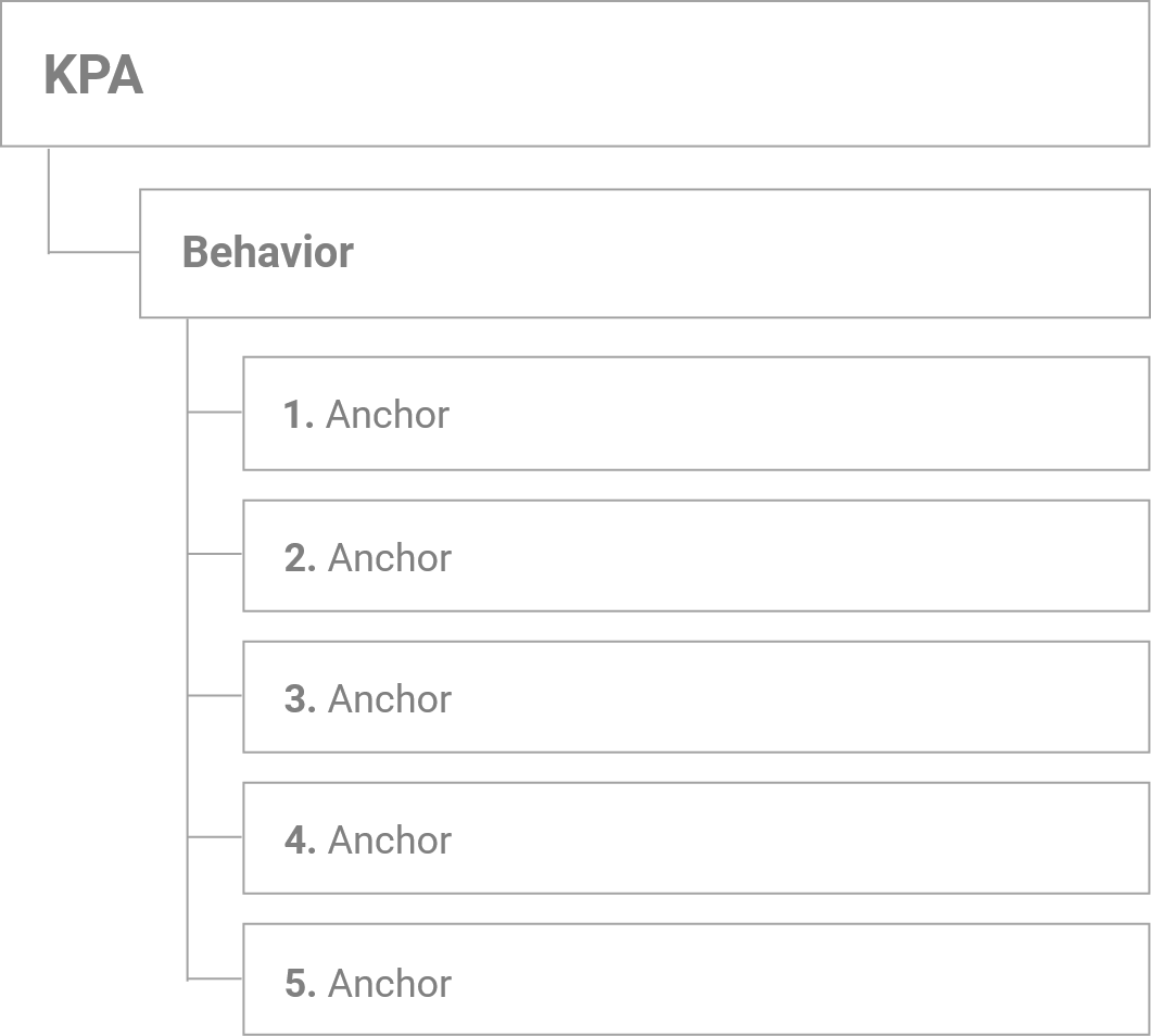
It uses rating systems to rate learners' performance. Rating systems are composed of KPAs, behaviors, and anchors.
But before anyone can use a rating system, someone has to create it.
I was tasked with improving the UX for authoring rating systems.
Role
Skills
Developed For
Background
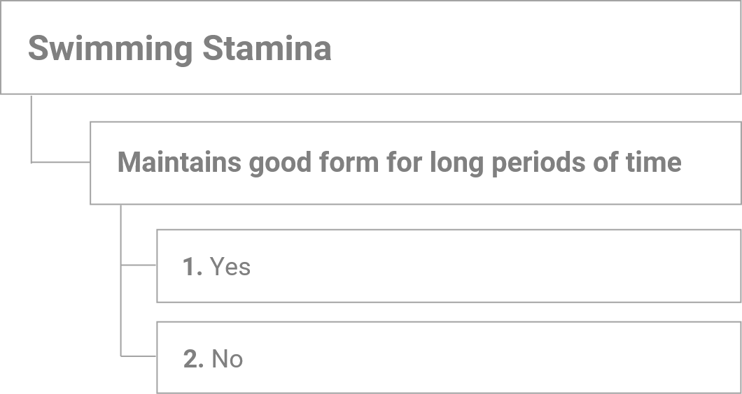
KPAs are a criteria with multiple characteristics (behaviors), which can be rated on a scale of 1-5.

Brainstorming
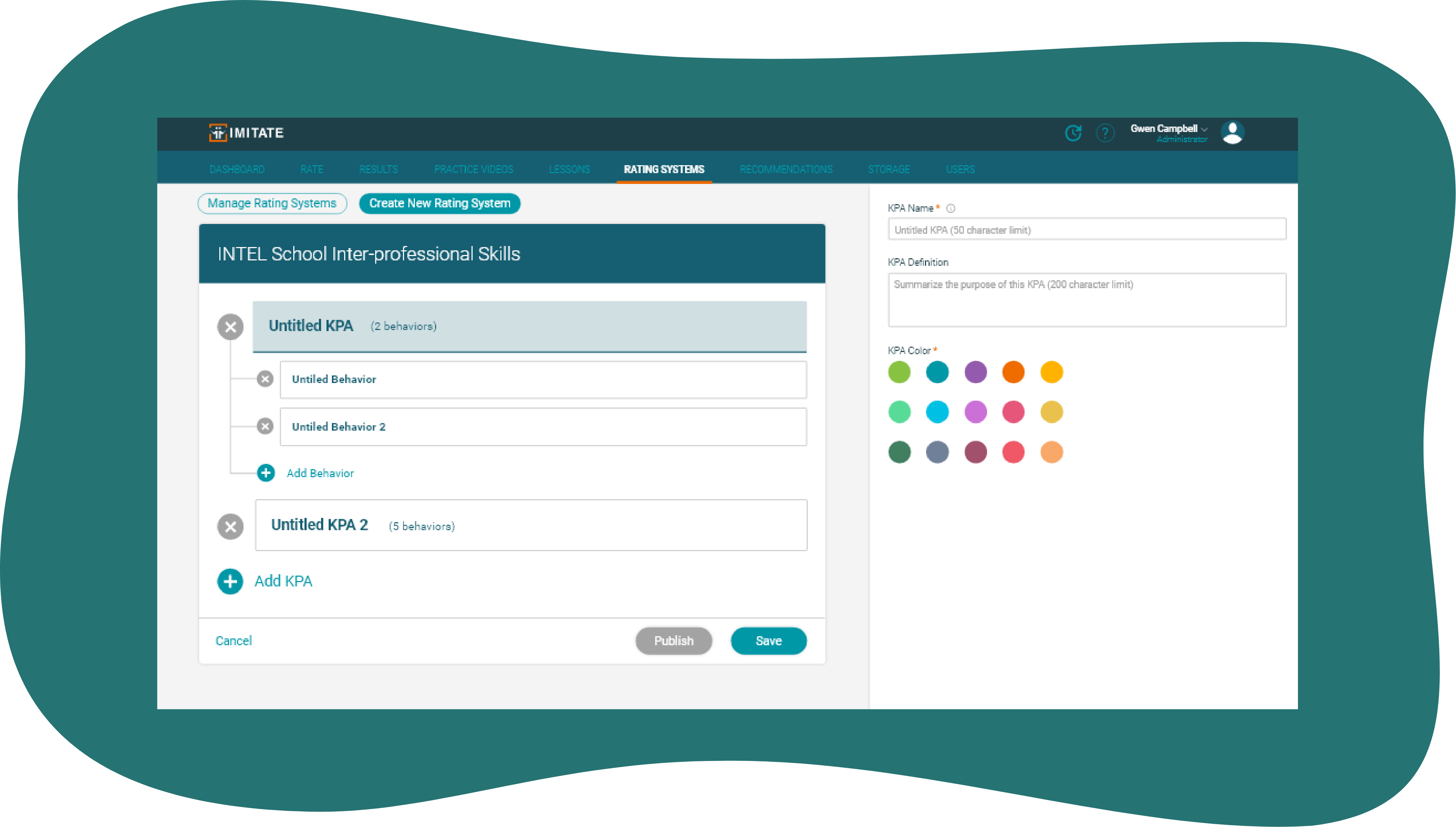
IMITATE already had a well-defined style that I could work from. I reused components like buttons and cards for the Manage Rating Systems list. The original design I inherited came with a card (left side) and form (right side).
Proposed Changes
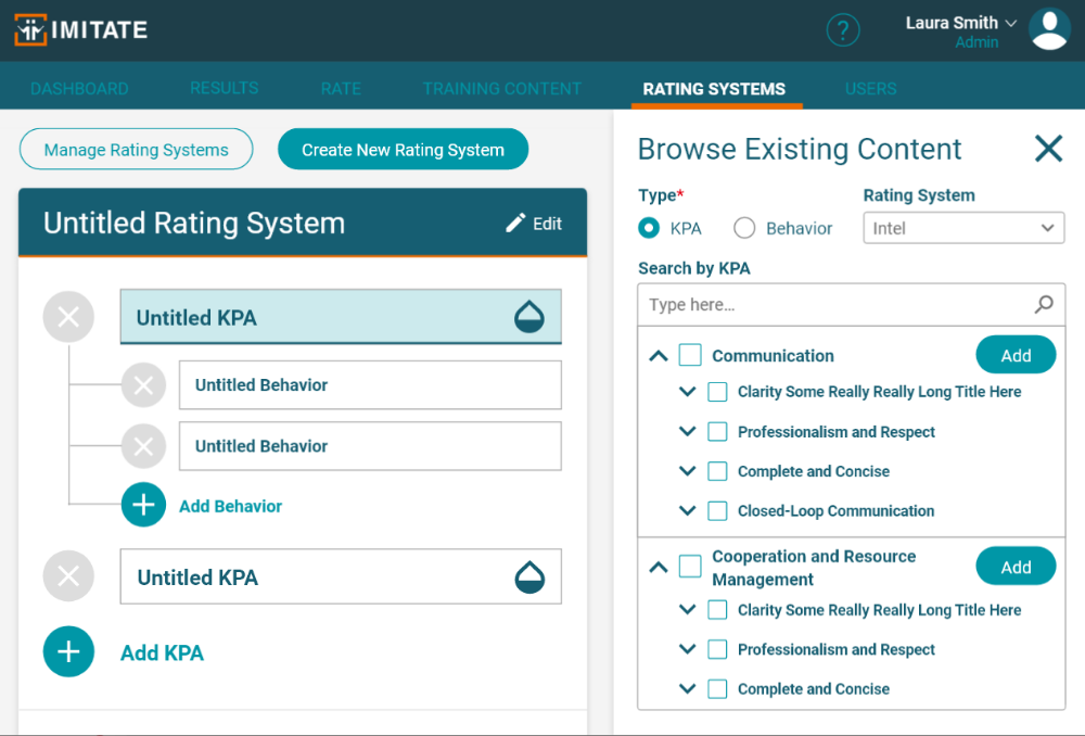
1.) Add a database drawing definitions from existing rating systems so the user wouldn't have to create KPAs/behaviors/anchors from scratch every time.
2.) Be able to interact directly with card because affordance implied it was interactive. At the time, users could only select a KPA or behavior rectangle but not type into it.
3.) Allow autocomplete when typing into the card. Have database results adapt as user was typing into form.
4.) Make form collapsible so space could be freed up.
Roadblock

A major challenge was defining how everything in the tree structure would connect.
The project manager requested that we allow users to cherry-pick KPAs, behaviors, and anchors and decide the number of each. This would allow countless mixing-and-matching combinations.
From a UX perspective, burdening the user with too many decisions would not be conducive to a pleasant app experience. I proposed chunking information to simplify the process for users.
After speaking to my teammates, I learned this was an issue on the research and development side too.
From the RA's perspective, anchors would not make sense out-of-context from their behaviors (because they are a rating scale defined in relation to their behavior).
From the devs' perspective, the numerous combinations create a mess in the database. Moreover, pre-existing tables tied behaviors and anchors together and would take significant technical effort to overhaul.
Our collective concerns led the team to a compromise: Behaviors and anchors must always be tied together, with the number of anchors staying the same.
Hi-Fidelity Prototype
Lessons Learned
Include developers early in the design process. Learning what is technically feasible prevents the team from wasting time. Thanks to some feedback from the Marines who used the BETA, we added the ability to add an existing KPA and its attached set of behaviors in one click (seen below).